3 Reasons Why Brands Engage in Blanding
Recently, there has been a trend where a number of brands are rebranding by simplifying their logos. This phenomenon is known as “blanding”; rather than competing to stand out, various brands are changing their logos to be simpler and more minimalist so they can blend in better with other brands in their industry.
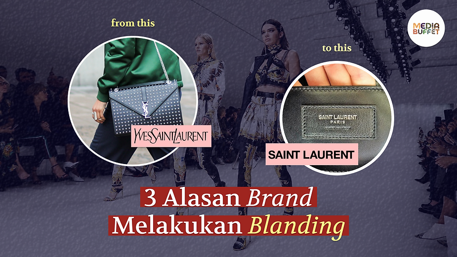
One of the clearest examples of blanding can be seen in the fashion industry. High-end brands such as Yves Saint Laurent, Balenciaga, Burberry, and Balmain have replaced their distinctive and unique old logos with “sans-serif” fonts that aren’t much different from those of other high-end fashion brands. Yves Saint Laurent even shortened its brand name to Saint Laurent as part of this “blanding” process.

(source: businessoffashion.com)
Amid the trend of brands “blending” their logos, this phenomenon has also drawn significant criticism. Those opposed to this trend generally argue that brands will lose the identity and distinctive characteristics they’ve built over decades. This criticism has a solid basis, as one of the most important aspects a brand must possess is differentiation—an element that is typically emphasized in the branding process.
So, why are these major brands blanding their logos, even though the process has the potential to erode their brand identity?
Table of Contents:
Simple logos are better suited for display on smartphones
A survey conducted by Hootsuite shows that the number of smartphone users worldwide has now reached 5.22 billion, while the number of internet users worldwide stands at 4.66 billion. Thus, it is undeniable that smartphones and the internet have become an integral part of people’s lives.
People use smartphones for a wide range of activities, from obtaining and sharing information, to seeking entertainment, to making purchases. This is one of the main reasons brands decide to go mobile. Not only does it make it easier for users to see the logo clearly, but it also ensures the image size is optimized for the screen size of each smartphone.
A simple logo looks more modern and versatile
When a brand’s logo features intricate details and a complex color scheme, it becomes less versatile and often loses its effectiveness.
Digitally, such a logo may look good, but the results will be less than optimal when printed, embroidered, or scaled down. Additionally, a simplified logo aligns better with modern design trends that prioritize minimalism.
It’s easier to maintain logo consistency across various platforms
Nowadays, there’s hardly a brand that isn’t active on social media platforms like Instagram, Twitter, and TikTok. With so many social media platforms to manage, brands must strive to present visuals that fit each platform’s specific format.
A visual style that works well on Instagram may not necessarily work on other platforms like Twitter or Facebook. Complex logos and visual styles make this adaptation process more difficult and less effective, making them less compatible for use across various digital platforms.
So, those are a few reasons why brands decide to “blend” their visuals. While simplifying a logo is the easiest way to accommodate various platforms, if executed poorly, the brand risks losing its identity—which ultimately makes it difficult for customers to distinguish the brand from its competitors.
Written by Cinthya Namira & Savira Chesaria, PR Consultant Interns at Media Buffet
References: